Collection Onboarding
Background
This is an internal project for my employer, CrystalCommerce.
I collaborated on this with the other designer at our company.
Challenge
After a user creates a new account using our upcoming SSO (Single Sign-On) system, we need to determine what types of products they’re interested in, so we can build out their dashboard and the rest of their onboarding experience.
- Aspect one of this UX project was to design the section of the fan onboarding process where they get to choose their interests.
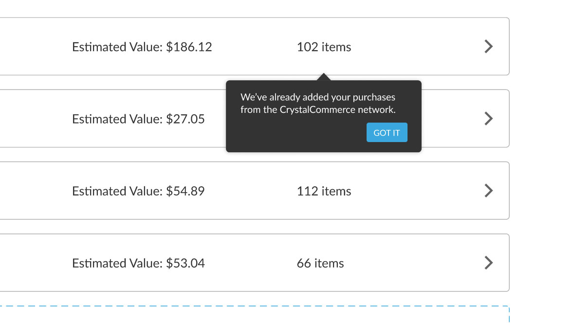
- Aspect two was to build in the UX for when a user has past purchases on file in our system. (If a user’s contact information matches that of any previous, legacy accounts registered to any store in our network, we will be able to connect their purchased items into their new account.)
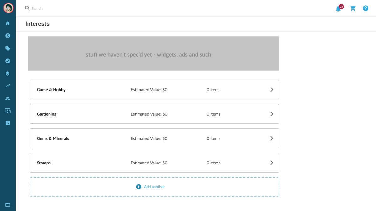
- Aspect three, which was technically a separate project, was to design the “Collections” interface. This is basically a display of products which this user has in their personal collection, in this case including their purchase history which we automatically imported in for them.
Approach
We started, as always, with a brainstorming and collaboration session, followed by a bit of basic research.
Some of the questions we asked ourselves:
- Who is the super fan?
- What might be an appropriate way to display the experience to this type of person?
- What would be the most effective way to get the information we need from them?
- How do these steps affect, or connect to, later portions of this user’s journey?
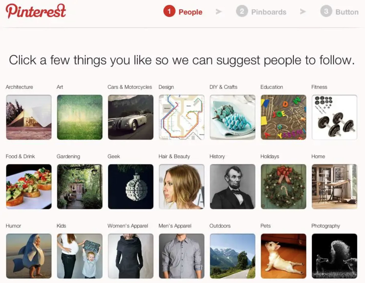
We researched and compared solutions from other online services which were also collecting metadata about a user’s interests.
Pinterest’s sign up process is one example we drew inspiration from.
Process
The next step was to create very basic wireframes and play around with the idea. We wanted to make sure it made sense and we weren’t overlooking anything important, before moving forward too much.
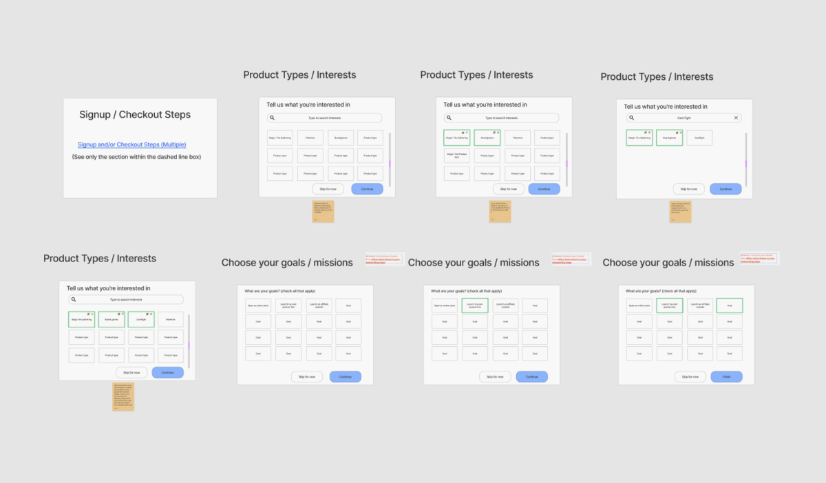
After some basic user testing, we moved forward with higher fidelity designs.
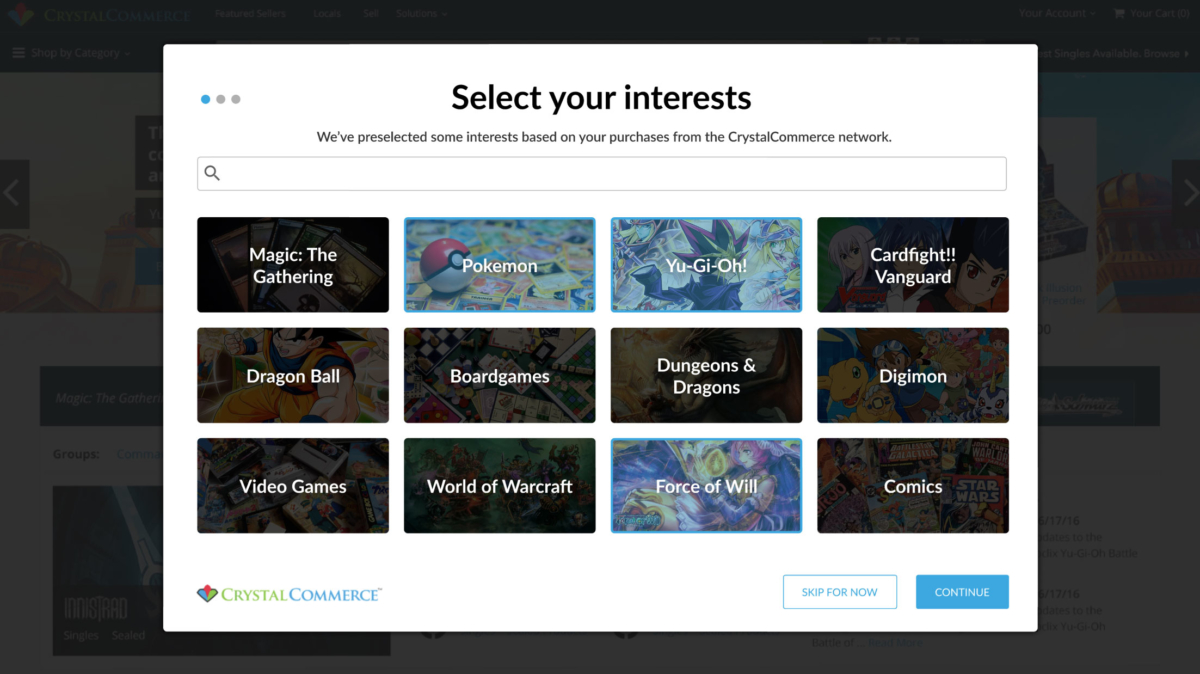
Earlier versions, such as the one above, were too cluttered and had some elements which initially seemed like a good UX, but were found in the long run to contribute to a worse UX, so they were removed. For example, the ability for the user to skip the step of choosing their interests. If few or no interests were selected, we would not be able to immediately deliver the core value we provide, so it had to be removed.
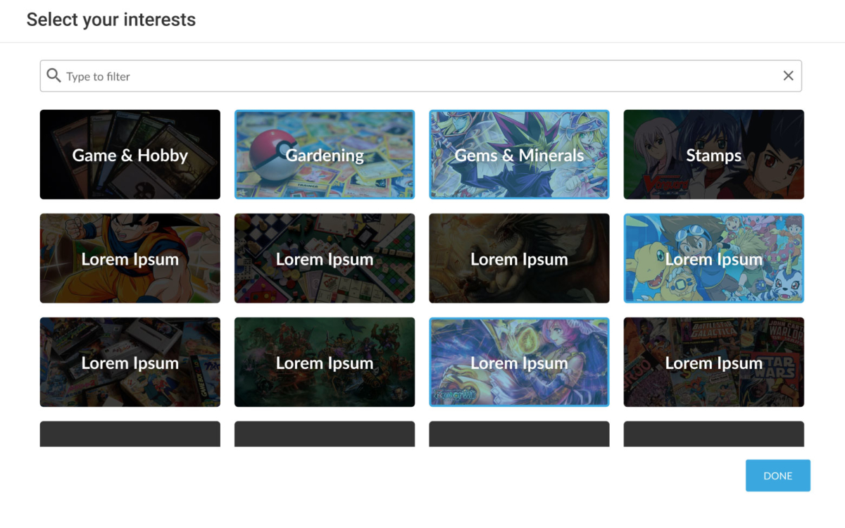
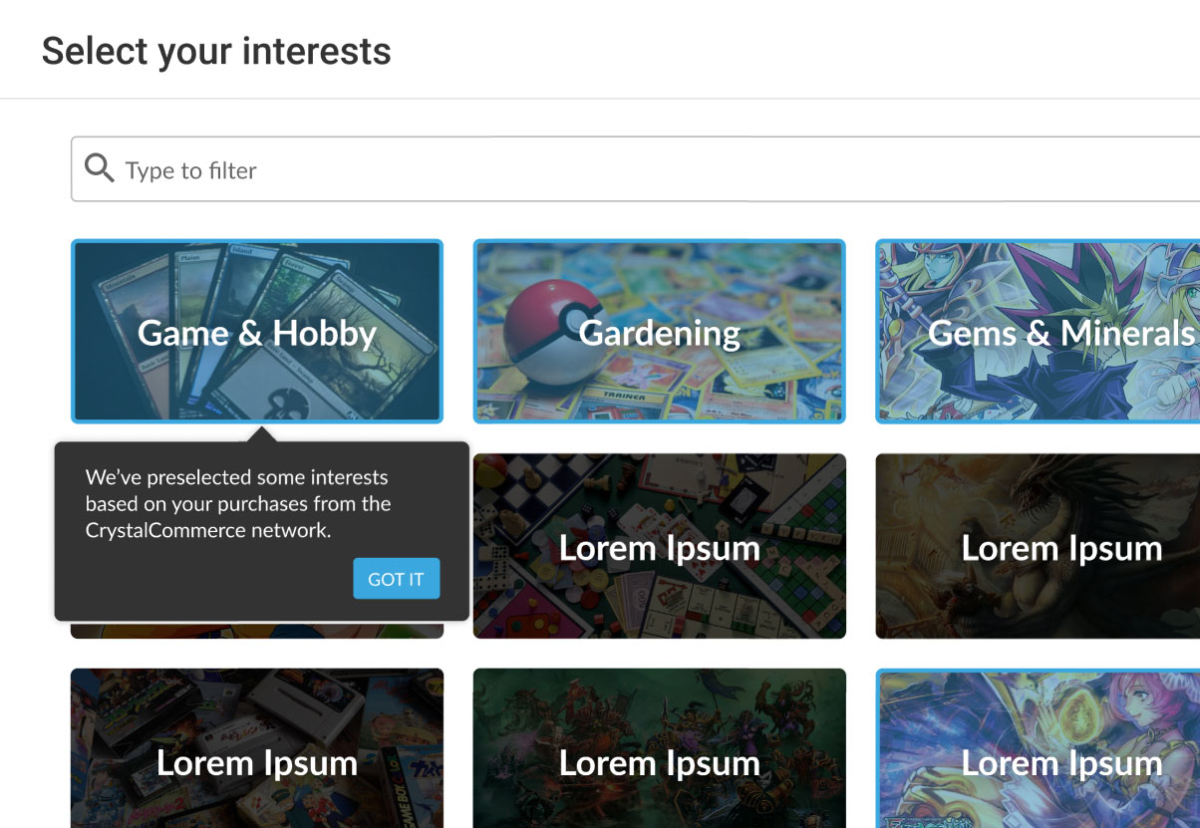
The UI in the newer version below has been greatly simplified, making the experience as frictionless as possible and keeping the user focused on what matters.
Informing the user that we have records of their interests.
Informing the user that we’ve imported their purchase history.
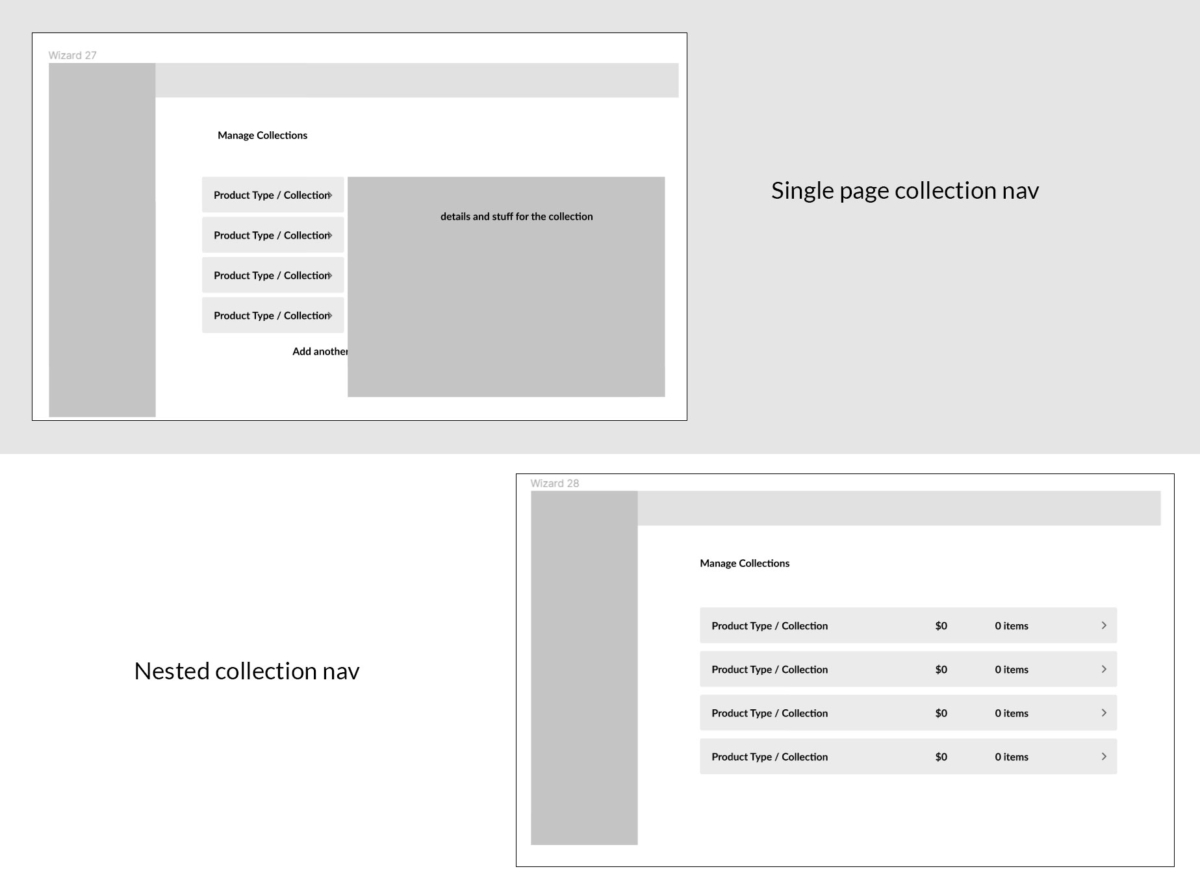
We did various exploratory designs for how we could display the user’s collection in their admin.
Two possible collection display methods.
Higher fidelity prototype of the better option.
Solution
In the end we arrived at a UX which is simple, fast, fun, and helps the user understand that their purchase history is being merged into the new account.
Click the preview below to play a short demo video of the desktop experience for onboarding a user with a purchase history.
Click the preview below to play a short demo video of the mobile version of the experience.